Tocker Foundation
Tocker Foundation has profoundly impacted hundreds of rural libraries through grants starting in 1992. They’ve continued to grow since the first fully responsive website was designed in 2017 by Wagging Labs. Since then, the Foundation has enhanced the visibility and utility of public libraries, advocated for broadband access, and provided continuous support and advocacy through its philanthropic efforts.
View Site
The Challenge
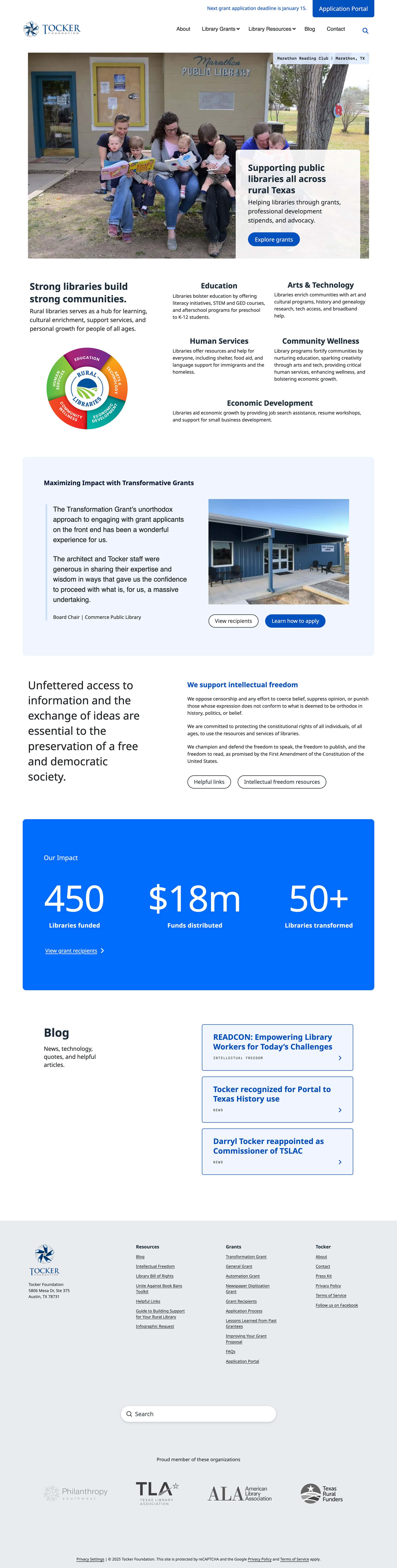
In response to escalating censorship, both national and local organizations have developed resources to support libraries in championing intellectual freedom. Over time, the addition of new content and the evolution of website software necessitated a redesign to better organize content and establish consistency.
The Solution
The primary goal was to create a user-friendly website. Our approach involved a thorough evaluation of the existing content and a structural overhaul of the site. We streamlined the navigation by merging, relocating, or removing pages and sections. Each page was refined to include sequential headings, meta descriptions, and clear calls to action.
Blog Redesign
The blog received a comprehensive update: categories and tags were reorganized to improve content discoverability, post titles were optimized for brevity, and images were resized for uniformity and enhanced social media sharing. We introduced custom layouts for the blog archives and a unique design for quote posts.
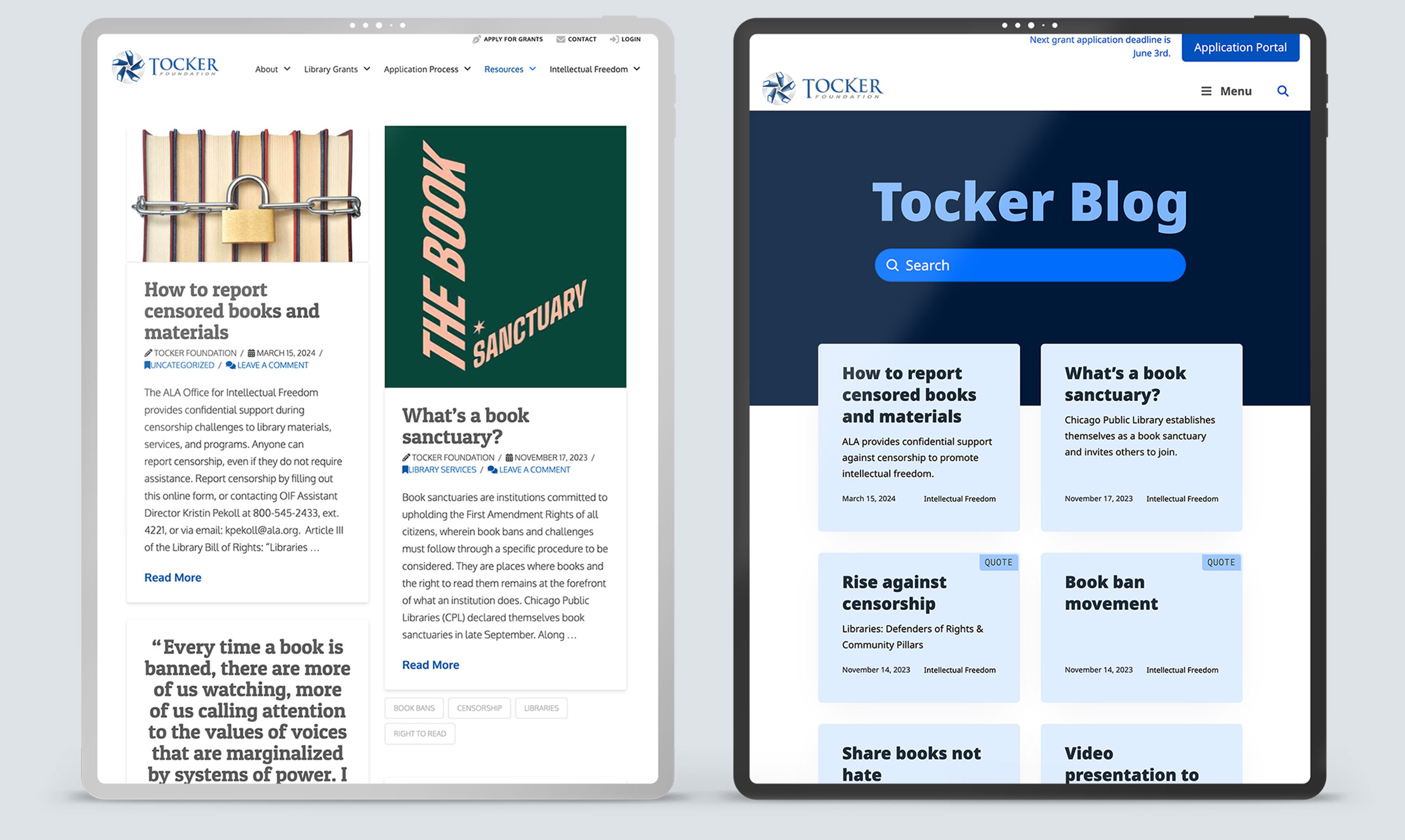
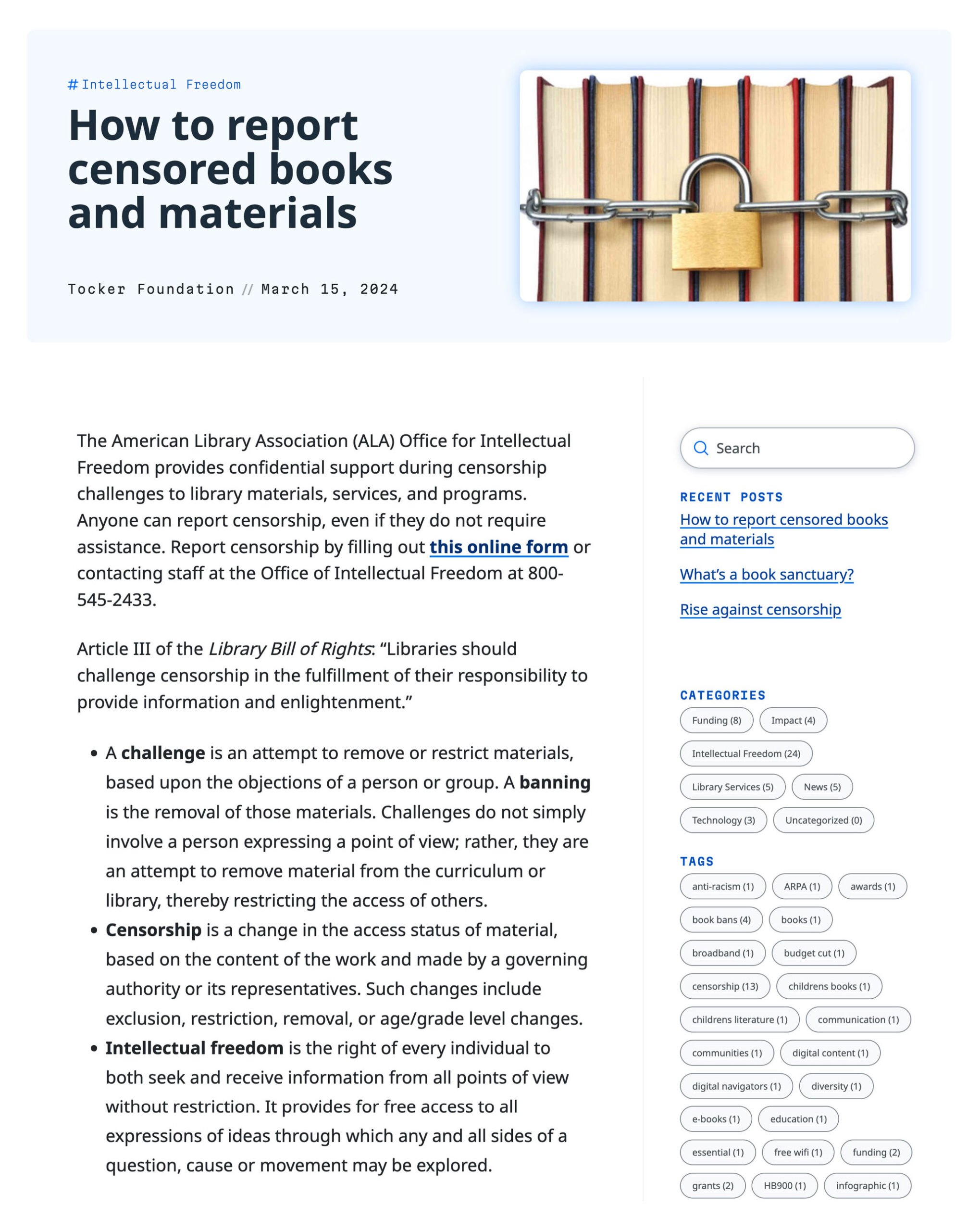
The standard post layout includes a two-column header with a featured image cropped to a uniform size.
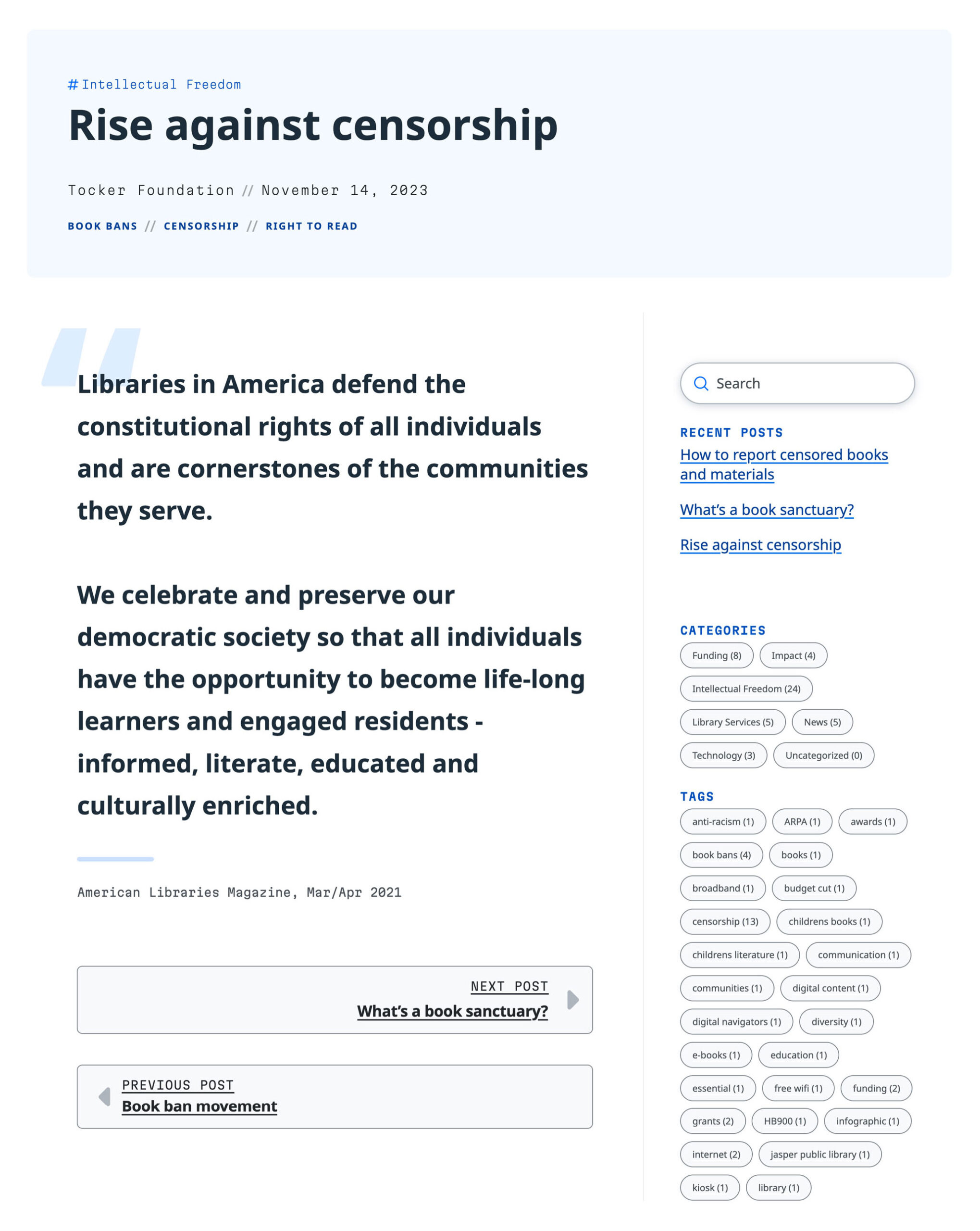
The quote post layout features a single-column header with predefined styling for the quotation and author.
Accessibility
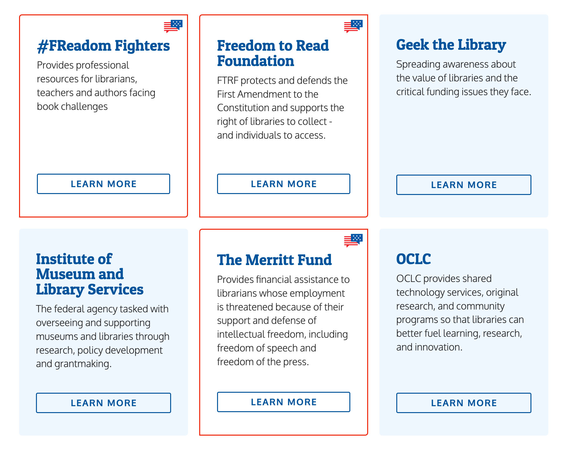
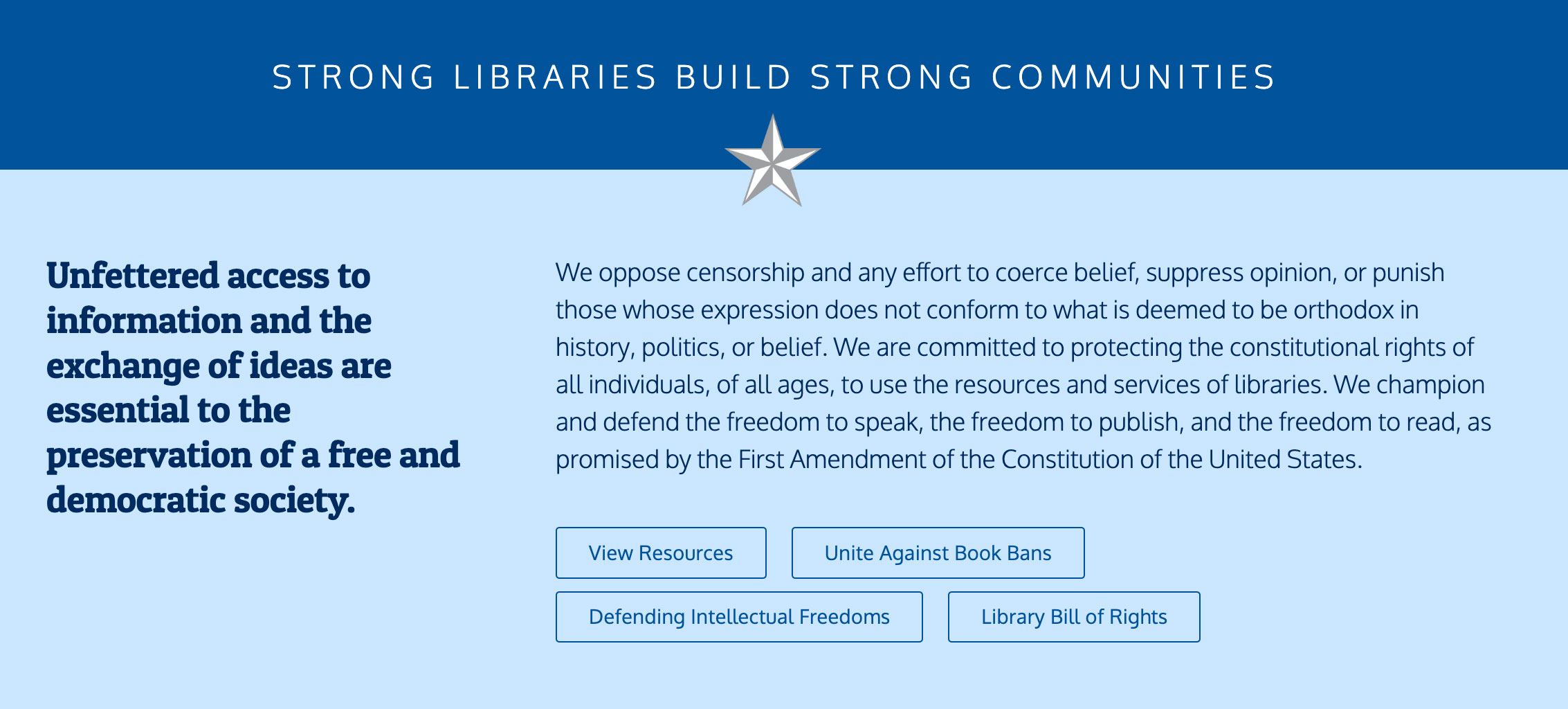
Accessibility was prioritized by adhering to best practices for typography, links, buttons, colors, and menus. The website meets the basic Web Content Accessibility Guidelines (WCAG) and goes beyond to accommodate users with low vision or color impairments. All elements of the site are keyboard navigable and include ARIA labels to enhance screen reader functionality.
The design employs straightforward one- and two-column layouts to provide a consistent experience across both mobile and desktop devices.
By minimizing complex transitions and avoiding oversized images, we ensure quick loading times, which is particularly advantageous for users with limited broadband access.
Calls to action and primary buttons were designed using the brightest shade of blue to effectively capture attention.
“
I’ve been working with Janel for years, and it’s always a pleasure. Recently, we were talking about adding a new resource to our website—something totally different from what we’ve done before—and she asked questions and made suggestions I never would’ve thought of. That’s one of the main reasons I love working with her: she sees things differently, and it always helps move things forward.

Karin Gerstenhaber
Tocker Foundation