How a redesign empowered Tocker Foundation to support rural libraries

The Challenge
Since 1992, the Tocker Foundation has profoundly impacted hundreds of rural libraries across Texas through grants and advocacy. By 2017, we partnered with the Foundation to launch their first fully responsive website, which grew into a platform for visibility, resource-sharing, and broadband advocacy.
But as censorship threats escalated nationwide, libraries needed Tocker’s website to do more. New resources had been added piecemeal over the years, and outdated software made it harder to keep information consistent and accessible. The site no longer reflected the clarity or authority the Foundation needed to champion intellectual freedom.
The Solution
Services Provided
I’ve been working with Janel for years, and it’s always a pleasure. Recently, we were talking about adding a new resource to our website—something totally different from what we’ve done before—and she asked questions and made suggestions I never would’ve thought of.
That’s one of the main reasons I love working with her: she sees things differently, and it always helps move things forward.

Karen Gerstenhaber
Tocker Foundation
Information Architecture
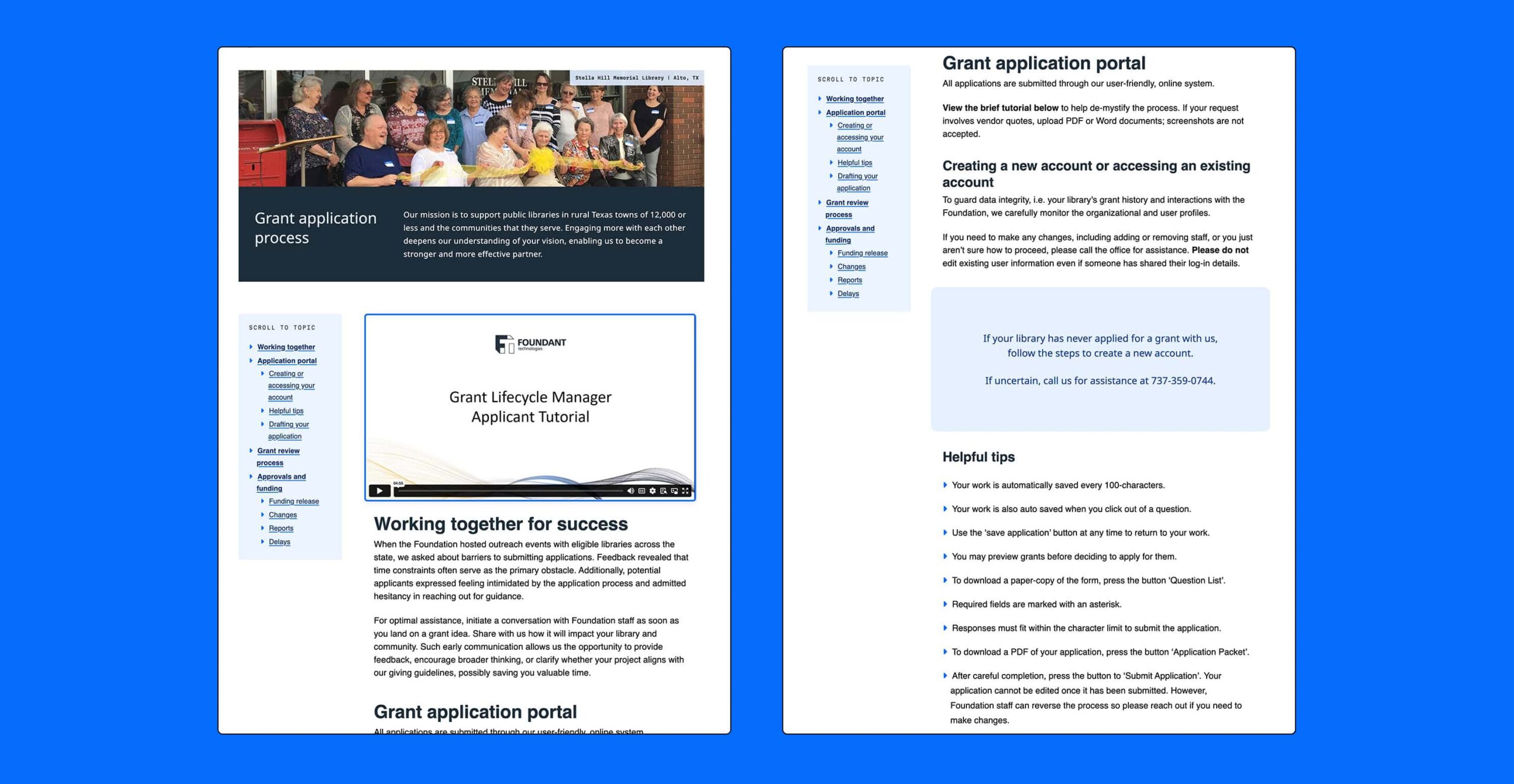
Building for Users and Growth
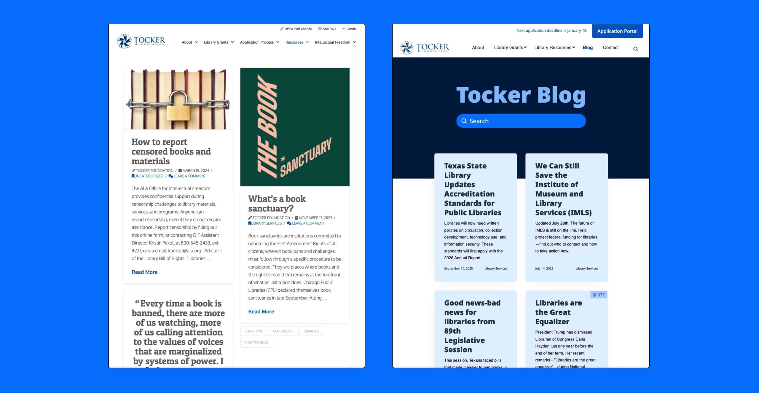
Blog Redesign

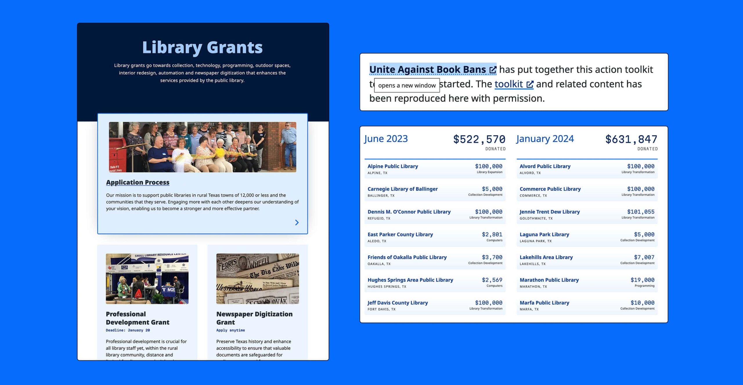
Accessibility
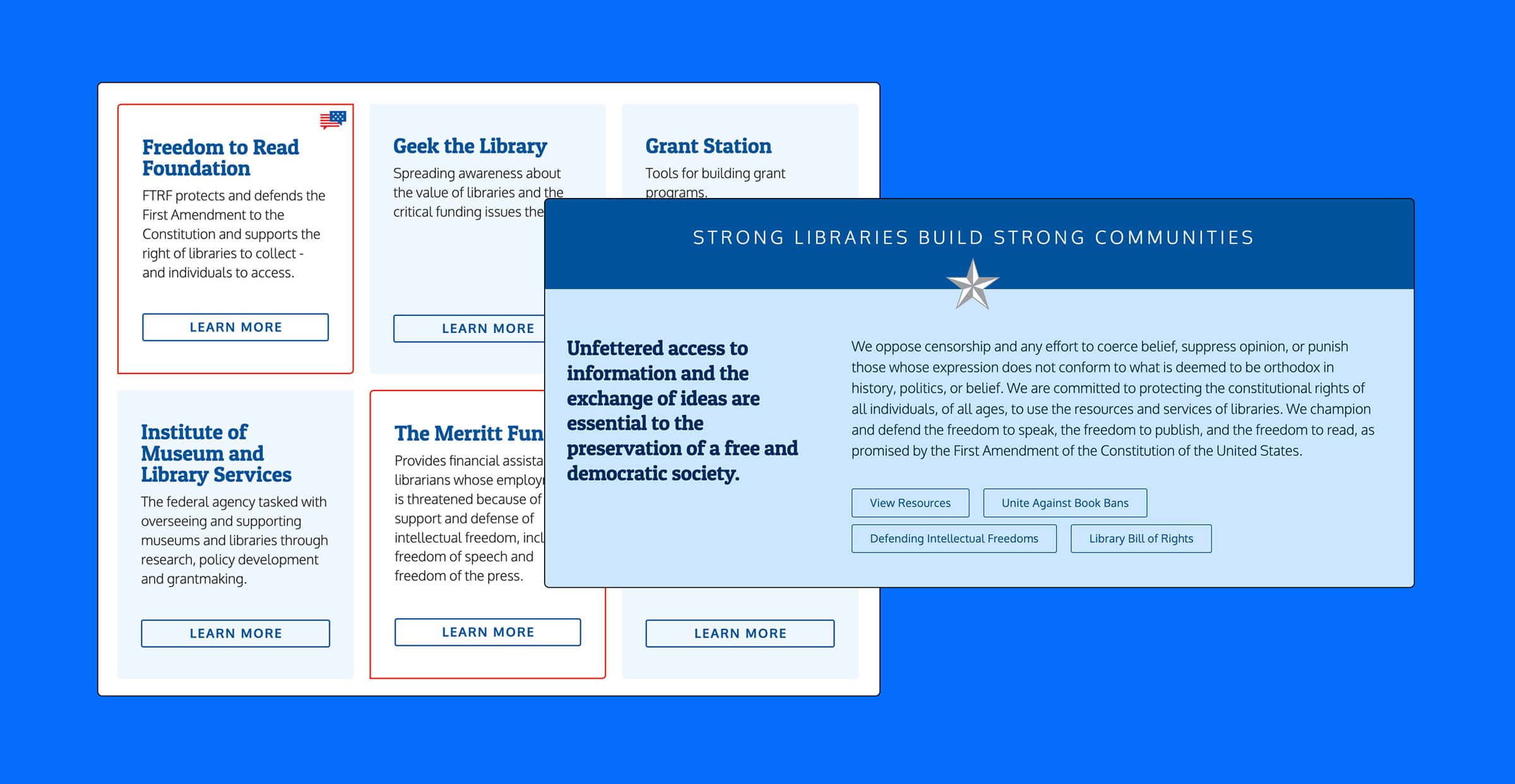
Visual Design
The Results
- The improved blog structure strengthens advocacy efforts by making timely updates and thought leadership easier to find and share.
- Accessibility improvements ensure inclusivity, aligning with the Foundation’s mission to serve communities of all sizes.
- Faster site performance supports rural communities with limited broadband access.